Theory of Light and Color

22. Color Classification Systems (Part 2): Color Chart Systems (Color Order Systems)
The color chart system is a simple color classification system based on the three attributes of color. They are hue, such as blue or red, value, indicating lightness, and chroma, indicating color intensity. Although the three attributes are technically interrelated, in many cases, they can be treated as independent of each other. ≪1≫ In practice, it is widely used as an intuitive way to understand color.
(1) Munsell Color System
The color chart system (color order system) is a uniform, three-dimensional organization of object colors arranged according to the three psychological attributes specified by symbols and numerical values. ≪2≫ The most well-known example is the Munsell color system. ≪3≫ The Munsell color system was proposed in 1905 by Albert H. Munsell, an American painter and teacher. ≪4≫
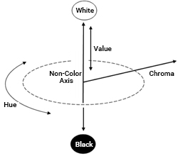
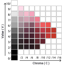
The Munsell color system uses Munsell value (V), Munsell hue (H), and Munsell chroma (C). Value is the non-color vertical axis of the three-dimensional space, hue rotates around the vertical axis, and chroma radiates outward from the vertical axis (value). The colors are evenly spaced and represented by combining symbols and numerical values.
If you compare it to a globe, value corresponds to the earth's axis from the North Pole (white) to the South Pole (black). Hue corresponds to the longitude indicating the direction of rotation around the earth's axis. Chroma is the distance from the earth's axis to its surface. A cross-section of the globe sliced perpendicular to the earth's axis on the equator shows a hue circle.
(2) Munsell Hue (H)
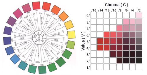
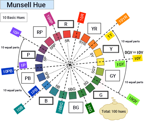
There are five principal Munsell hues: red (R), yellow (Y), green (G), blue (B), and purple (P), and five intermediate hues: yellow-red (YR), green-yellow (GY), blue-green (BG), purple-blue (PB), and red-purple (RP). Each color wheel is divided into ten equal size zones according to these basic hues.
Each zone is further divided into ten equal parts, which are assigned a number from 1 to 10 in the clockwise direction, so there are a total of 10 x 10 = 100 hues. In each basic hue zone, the purest representative of the hue is in the center. For example, 5Y is the yellow hue (Y). The hue closest to yellow-red (YR) is 1Y, and the one closest to yellow-green (GY) is 10Y.
(3) Munsell Value (V)
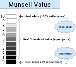
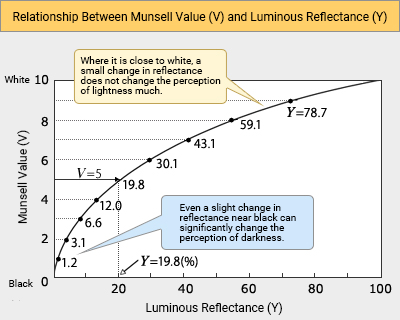
The highest Munsell value is 10, which represents an ideal white (reflection surface with 100% luminous reflectance). The Munsell value of ideal black is 0 (luminous reflectance is 0%). The vertical axis of the Munsell value is perceptually divided into 11 equal parts numbered 0 to 10 so that the feeling of brightness changes at a constant rate. ≪5≫
(4) Munsell Chroma (C)
For every Munsell hue at a specific Munsell value, there are varying degrees of chroma, from a low chroma value that is almost achromatic to a vivid color with a high chroma value.
Munsell chroma is arranged so that it increases in perceptually equal horizontal steps from the most achromatic color, represented as C = 0. The numbers are assigned at predetermined intervals as the chroma increases. The color farthest from the achromatic axis has the highest chroma for that hue.
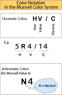
(5) Notation of the Munsell Color System
A specific color in the Munsell Color System is defined by listing the corresponding numbers for hue, value, and chroma in that order.
For chromatic colors, the display format is HV / C. Consider a red with the notation 5R4 / 14.
Hue = 5R (purest red)
Value = 4 (slightly darker than the medium value)
Chroma = 14 (extremely vivid)
You can intuitively associate the color just by looking at this display.
For achromatic colors, there is no concept of hue and chroma, only value, so N for neutral (achromatic) is added to the beginning of the value. For example, Munsell value 4 is N4.
(6) Pros and Cons of the Munsell Color System
The Munsell color system is so widely accepted because it has many advantages:
1. It is based on the three fundamental psychological attributes of color (hue, value, chroma), which makes it easy to understand colors intuitively.
2. The equispaced color arrangement ≪6≫ makes it easy to judge the quantitative difference between colors.
3. The HV / C notation is simple, and colors can be easily measured and displayed by visual comparison with standard color charts.
4. Universal property as a color system ≪7≫
On the other hand, it has certain limitations:
Applicable only to object color
The major disadvantage is that the color chart system (color order system) can only be applied to object colors, not to light source colors.
Unsuitable for high-precision color measurements
Humans can identify as many as 10 million types of colors. But it is impossible to include thousands of colors in one color chart, let alone 10 million. Applications that require strict color evaluation often find that there is no standard color card that matches the exact desired color.
No strict evaluation conditions
The color of an object changes depending on the spectral distribution of the light source, the physical characteristics of the object, and other conditions such as the angle of illumination and observation. JIS and other standards stipulate conditions for color evaluation experiments using color charts, but there is no strict enforcement.
This chapter introduced the Munsell color system as the most familiar general-purpose color system. In the next chapter, we will introduce the CIE color system, which is a high-precision display method for both light source colors and object colors.
Comment
≪1≫ Examples where hue, value, and chroma cannot be treated independently of each other:
1) Purkinje phenomenon
Cone and rod cells in the eye have different spectral response characteristics. Due to the Purkinje phenomenon, blue and red may be equally bright under photopic vision, but blue will be brighter than red under scotopic vision. In this case, hue and value are interrelated.
2) Bezold–Brücke shift
Perceived hue depends on the spectral distribution characteristics of the light source or reflective surface. The Bezold–Brücke shift is the change in hue perception when brightness (luminance) changes even if the light's hue is the same.
For example, when the brightness of a red light (660 nm) increases, the hue appears more yellow. Alternatively, when you increase the brightness of a green light (510 nm), the perceived hue is more blue.
There are invariant wavelengths that do not look different even if brightness changes. These wavelengths are 571 nm (yellow), 506 nm (green), 474 nm (blue), and 494C nm (purplish red).
3) Abney effect
If you mix white light with a monochromatic red light (630 nm) while keeping the value constant, chroma decreases, and the perceived hue becomes slightly yellowish red. The Abney effect describes this change in perceived hue, which occurs when adding white light desaturates a monochromatic light source. (Similar to the Bezold–Brücke shift, the Abney effect also has invariant wavelengths)
≪2≫ Definition of color chart system (color order system)
Color chart system (color order system): a systematic arrangement that quantitatively displays the perceived color of different color samples. (Source: Toshio Yamanaka, Basics of Color Science)
≪3≫ Other color chart system (color order system)
The Ostwald color system is a color chart system based on a different concept from the Munsell color system. Others include the DIN color system, NCS color system, and PCCS, but they are derivatives based on either the Munsell or the Ostwald color system.
≪4≫ Modifications to the Munsell color system
The Munsell color system was proposed by Munsell in 1905, but through subsequent evaluations, the Optical Society of America (OSA) modified the original model in 1943.
The modified system refined the perceptual equispacing of the three dimensions. This is the version used worldwide today, and it is simply called the Munsell color system without any distinction from the original.
≪5≫ Relationship between Munsell value and luminous reflectance
According to the Weber-Fechner law, the human senses (vision, hearing, taste, touch, and smell) are logarithmically related to the strength of the stimulus. In the case of sight, the higher the luminous reflectance of an object (Y), the more saturated the brightness perceived by the eye. The relationship between luminous reflectance (Y) and Munsell value is also logarithmic, as shown in the figure below.
≪6≫ Munsell color system spacing
One key characteristic of the Munsell color system is the equispacing of colors. Compared to the difference from R (red) to Y (yellow) and from Y (yellow) to GY (green-yellow), the differences from PB (purple-blue) to B (blue) and from B (blue) to G (green) look smaller.
This is because red, yellow, green, blue, and purple were the principal hues at the initial stage of determining the composition of the hue circle, and these five colors are arranged in five equal parts around the circumference.
Then the color difference from the adjacent color is divided into perceptually equal steps. While the colors are naturally equispaced for adjacent basic hues, those far apart are not perceptually equal.
Since color differences are often discussed between relatively similar colors, there are no major practical issues when interpreting the Munsell color system as perceptually equispaced.
≪7≫ Universal property
When Munsell created the color system, the highest chroma value of object color was C=10, and the difference between C=10 and C=0 (achromatic color) was perceptually evenly divided.
Because of advancements in developing colors with higher saturation, new chroma values have been added to the color chart over time. Today, the highest chroma value for each hue and value varies considerably, and as a result, the Munsell color system has become more complex.
Even if a new color with a higher chroma appears, there is no need to change the entire color system. It only requires adding a new number. This is one of the advantages of the Munsell color system.